
Campaigns.-
For each new campaign, multi-disciplinary artists will be invited to portray a theme reflecting the values of the brand.
Theme
Goddess of the moon, child of nature, she lived and guarded the forest and the animals who resided within. She has been admired throughout ages for her strength, independence and singularity.
Essential figure of the brand, Diana is Labatut’s logotype for the values she symbolises and inspires.
Diana
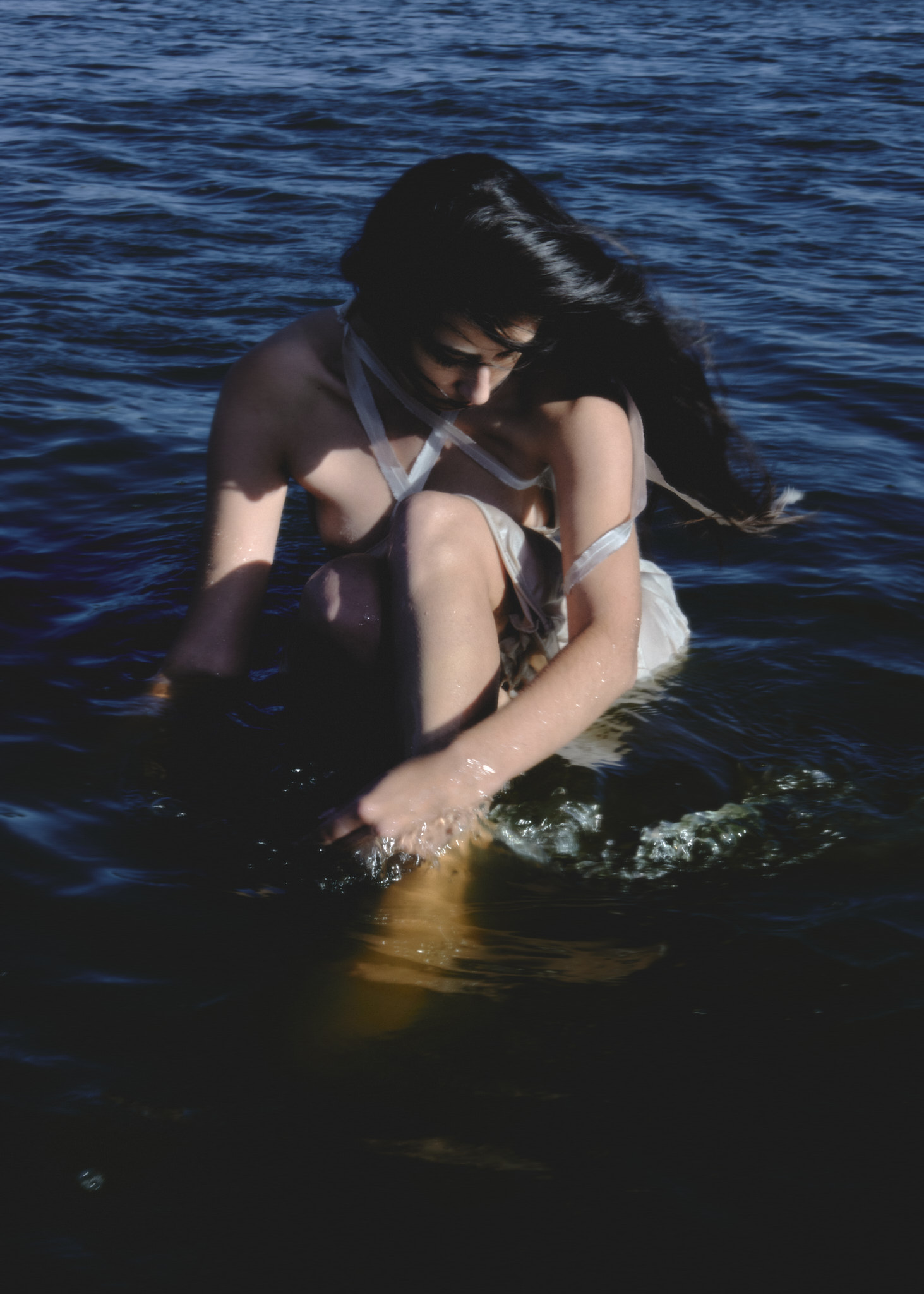
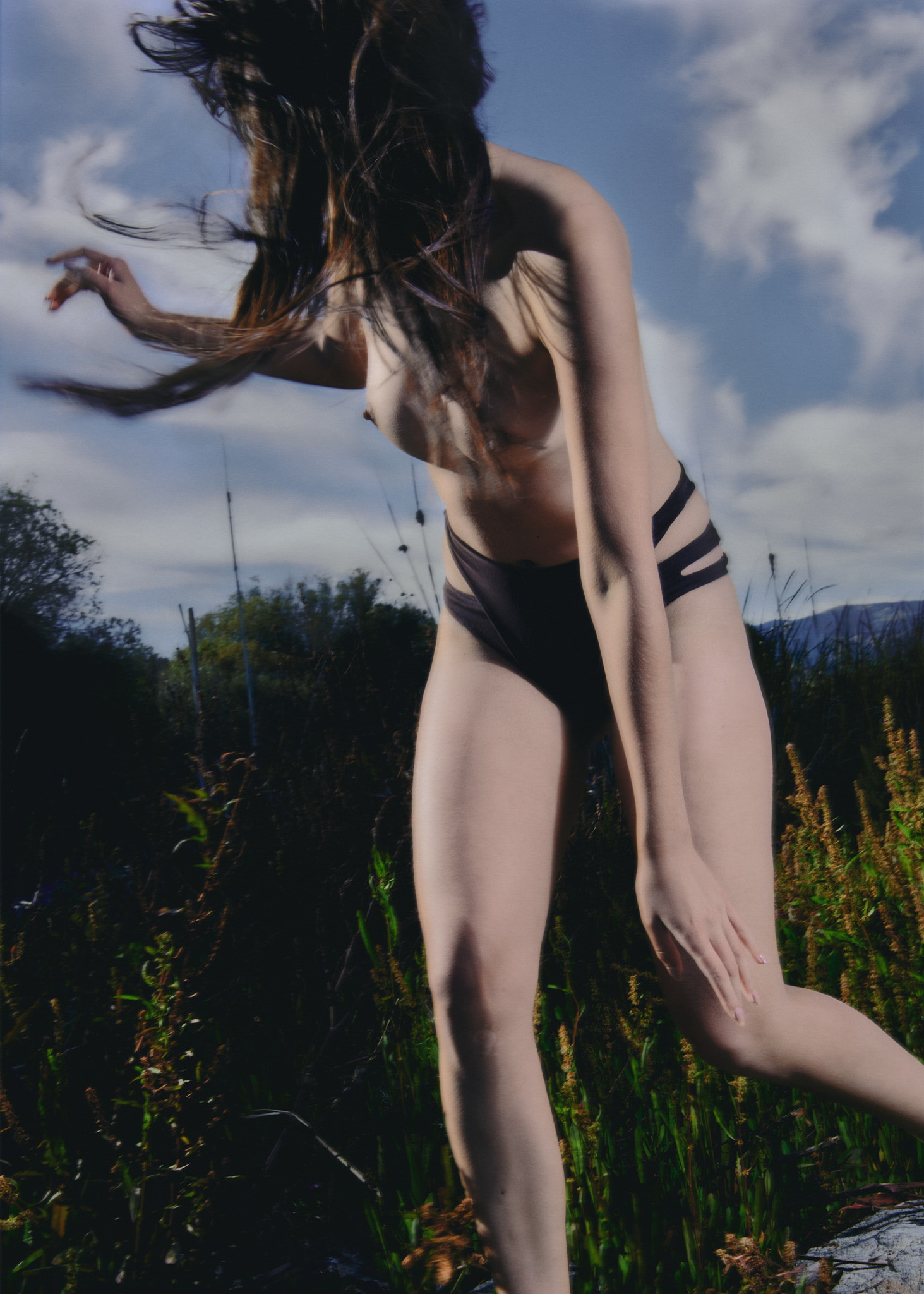
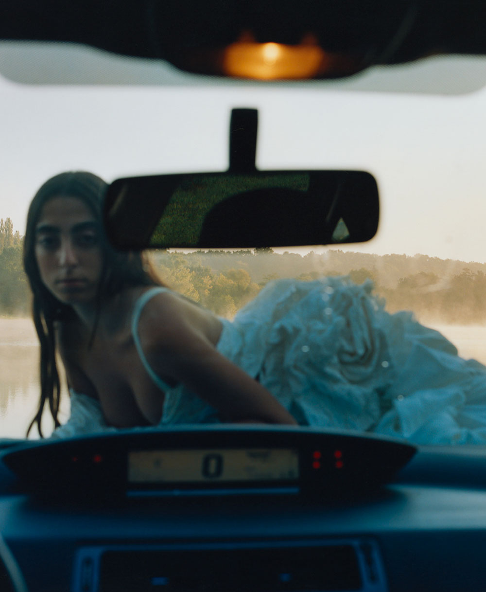
Y.-20, Campaign.-002, Diana
IN COLLABORATION WITH
ALEX CASCALLANA PHOTOGRAPHER (es)
STUDIO MITSU CREATIVE CONCEPTION
Notes by the artist:
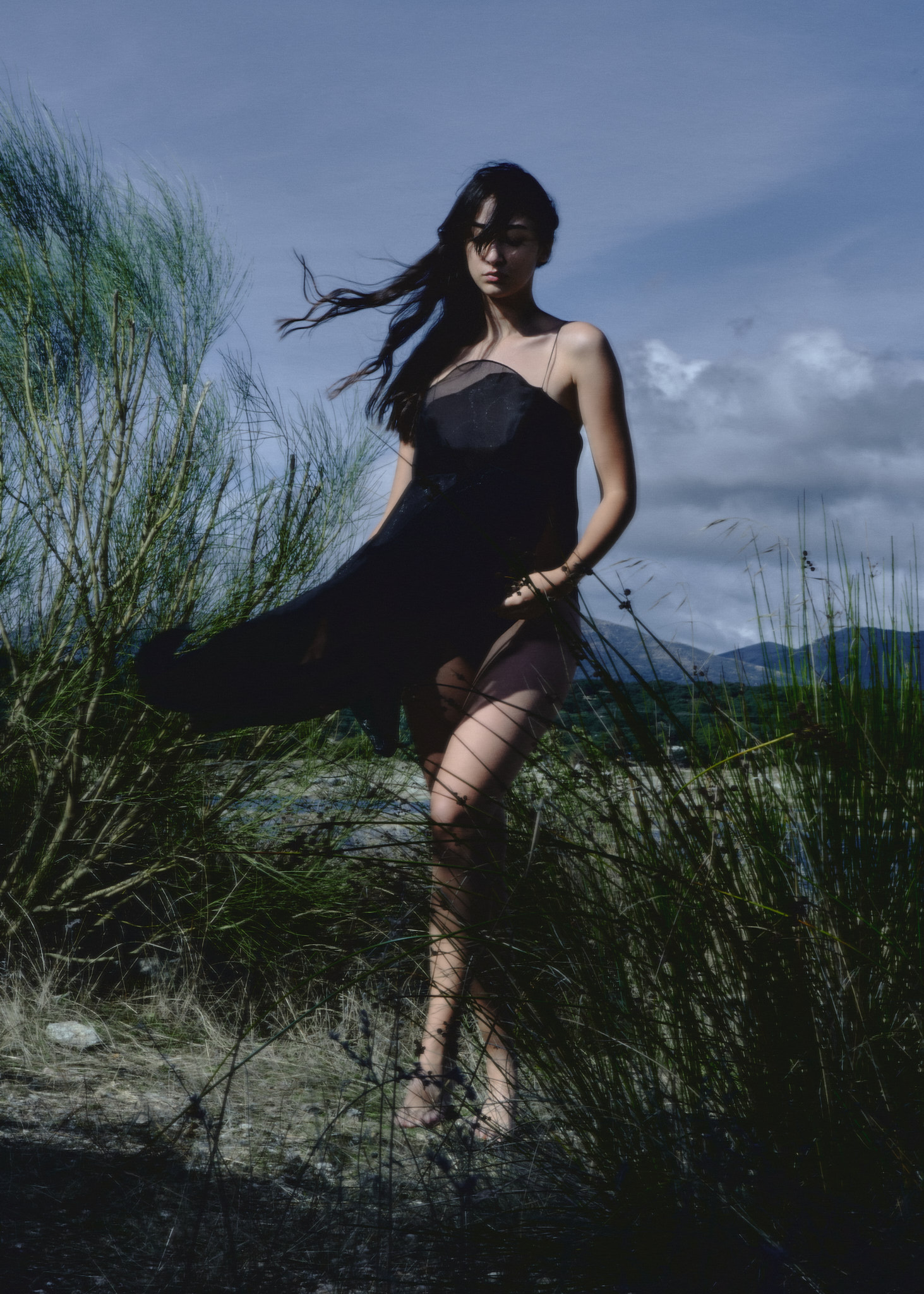
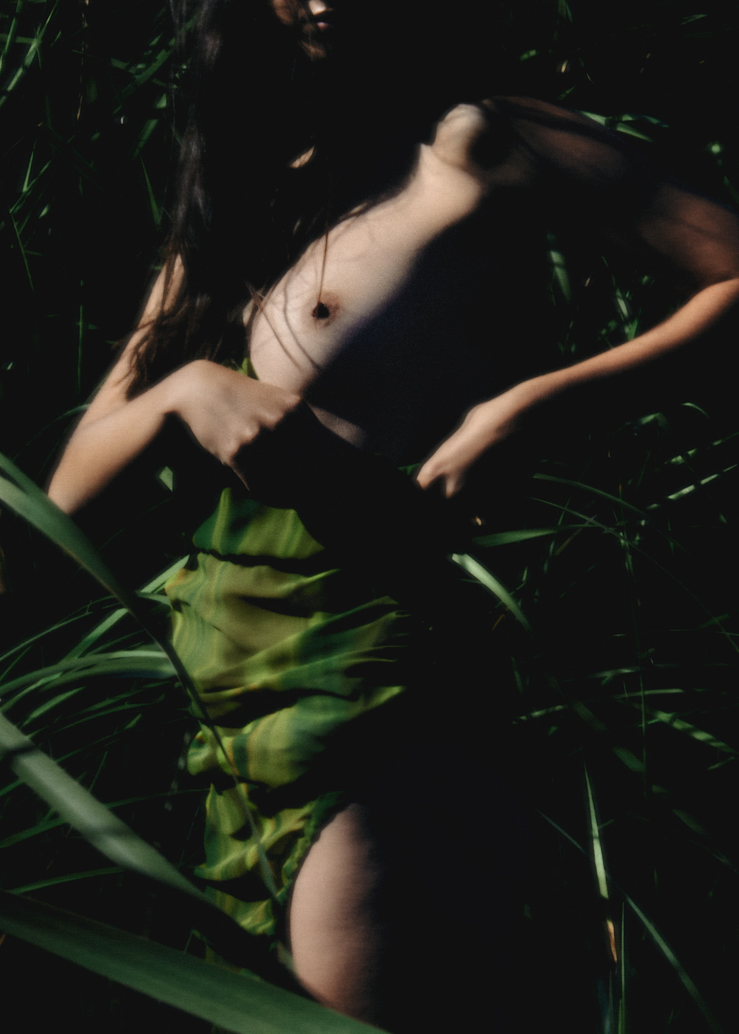
I like to think, at least in part, September is the first month of a new cycle. Maybe because we can enjoy the last summer days without the extremely hot weather of months before and at the same play with the firsts autumn winds.
It has been really great could portray and reflect the freedom and quietness of this period and put these feelings through the body of Adriana dyed of blue tones.
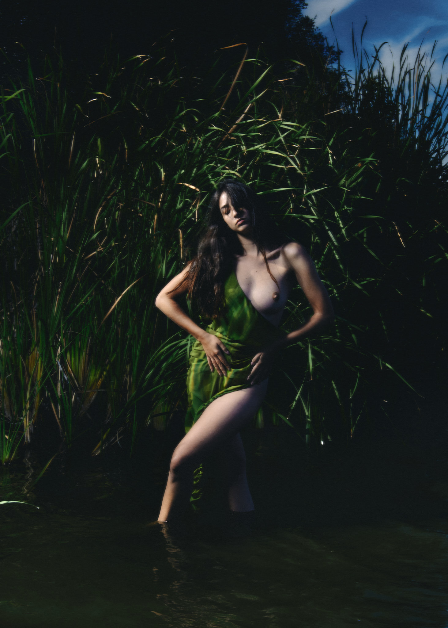
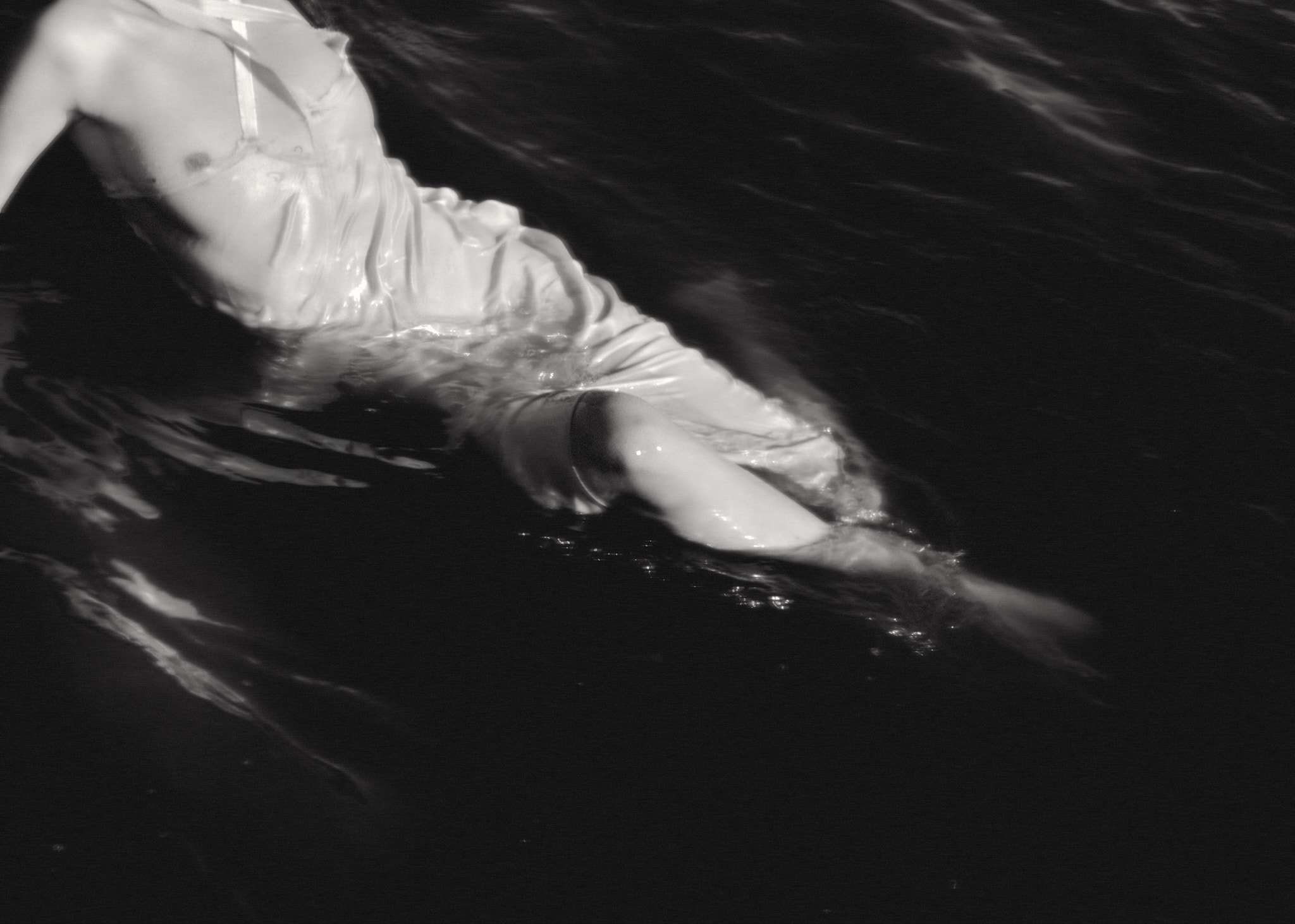
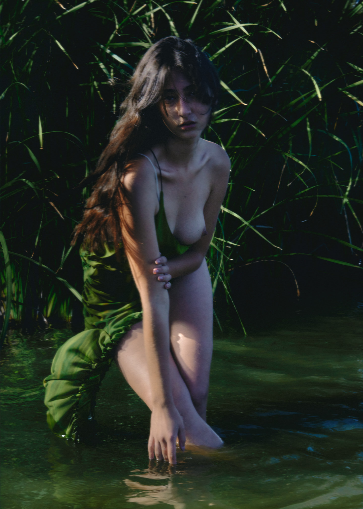
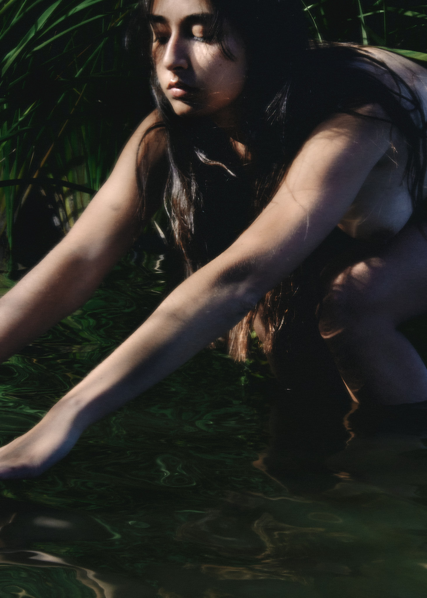
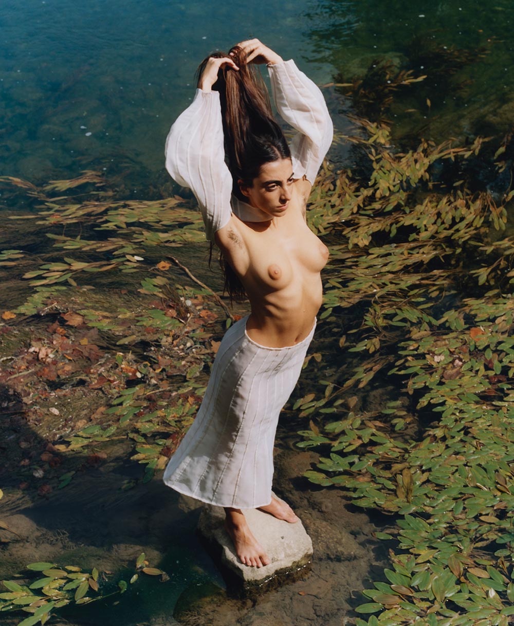
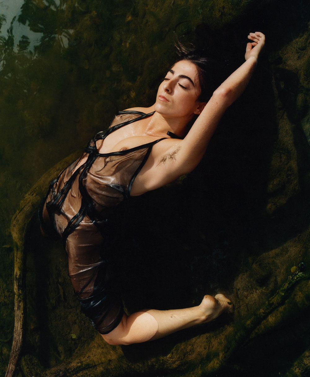
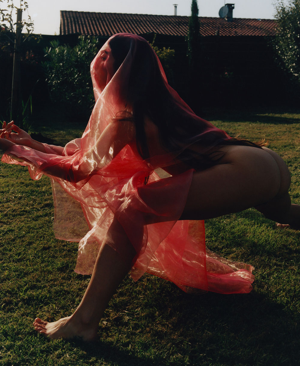
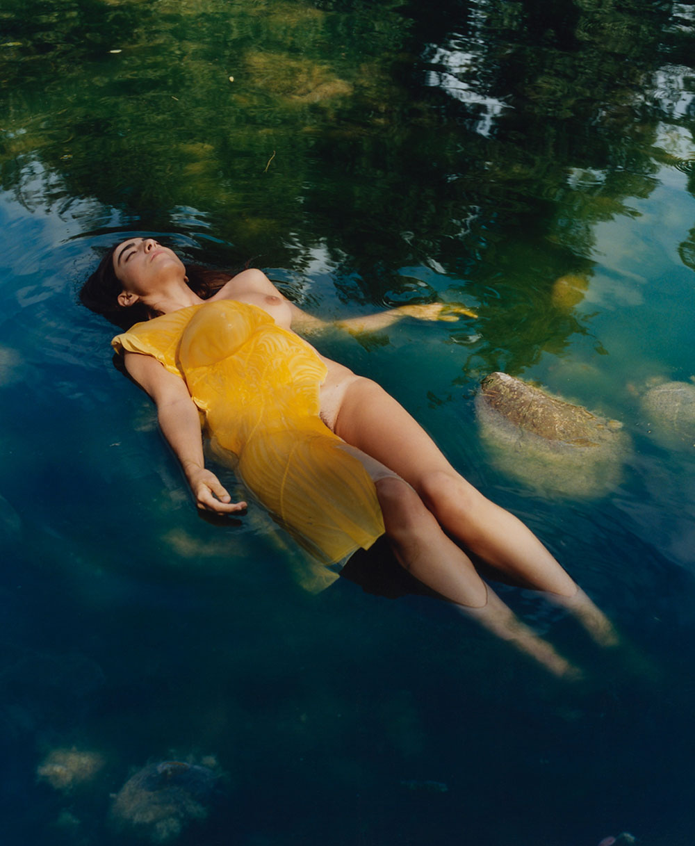
Y.-19, Campaign.-001, Diana
IN COLLABORATION WITH
STEPH WILSON PHOTOGRAPHER (uk)
EXTENSIVE CONVERSATIONS CO-CREATIVE PRODUCTION
STUDIO MITSU CREATIVE DIRECTION & CONCEPTION
Notes by the artist:
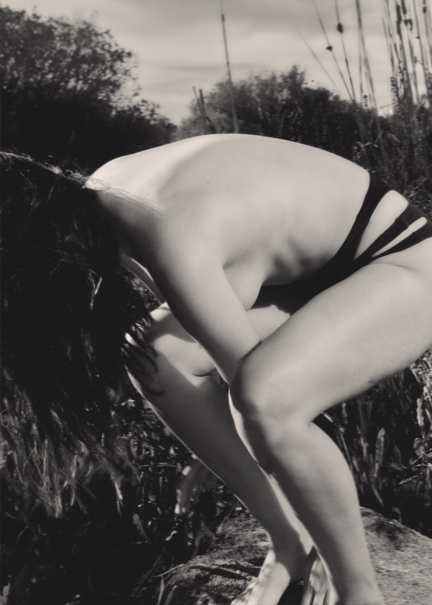
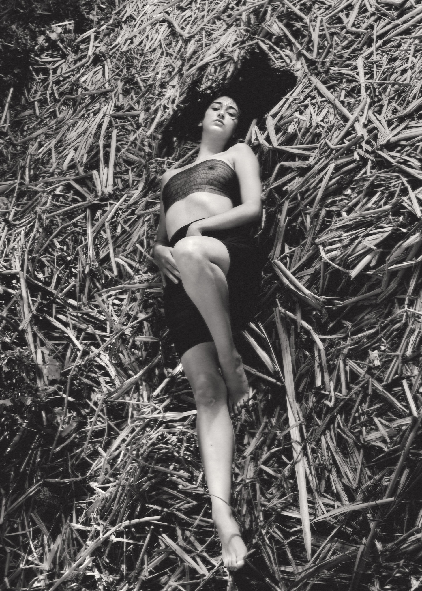
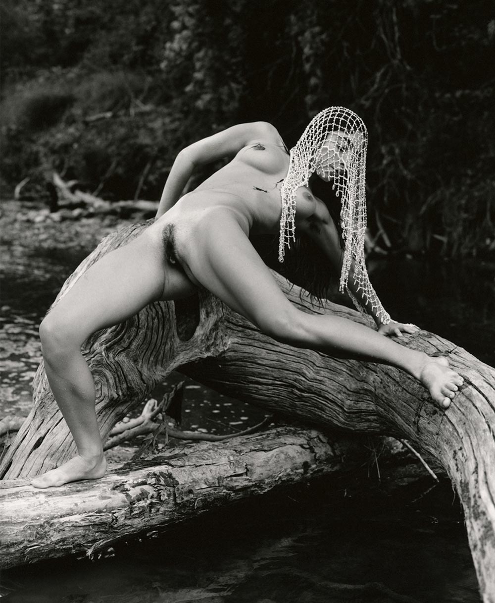
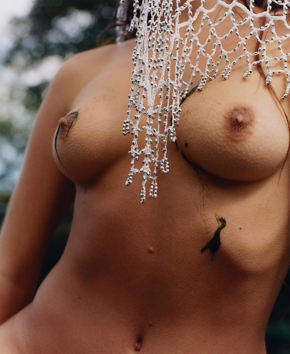
Given the theme of Diana, strongly referenced in Labatut’s branding, and the freedom to do whatever I wanted with it was a real treat (especially considering the ingredients of location, light and time I had access to.) I wanted to reflect a rawer angle of Diana, the Goddess of hunting, na- ture, and often associated with fertility.
I hoped that the story of whoever we shot would bleed into the character of Diana, as, I believe, she is in each of us. Mabel aches a confidence and sexuality in her movements: she is a cat, her performances are the hunt. Her dancing is a feral and brutal expression of female sensuality and confidence that I immediately wanted to incorporate into the images. After all, how much closer to being a Goddess than Mabel can you get?


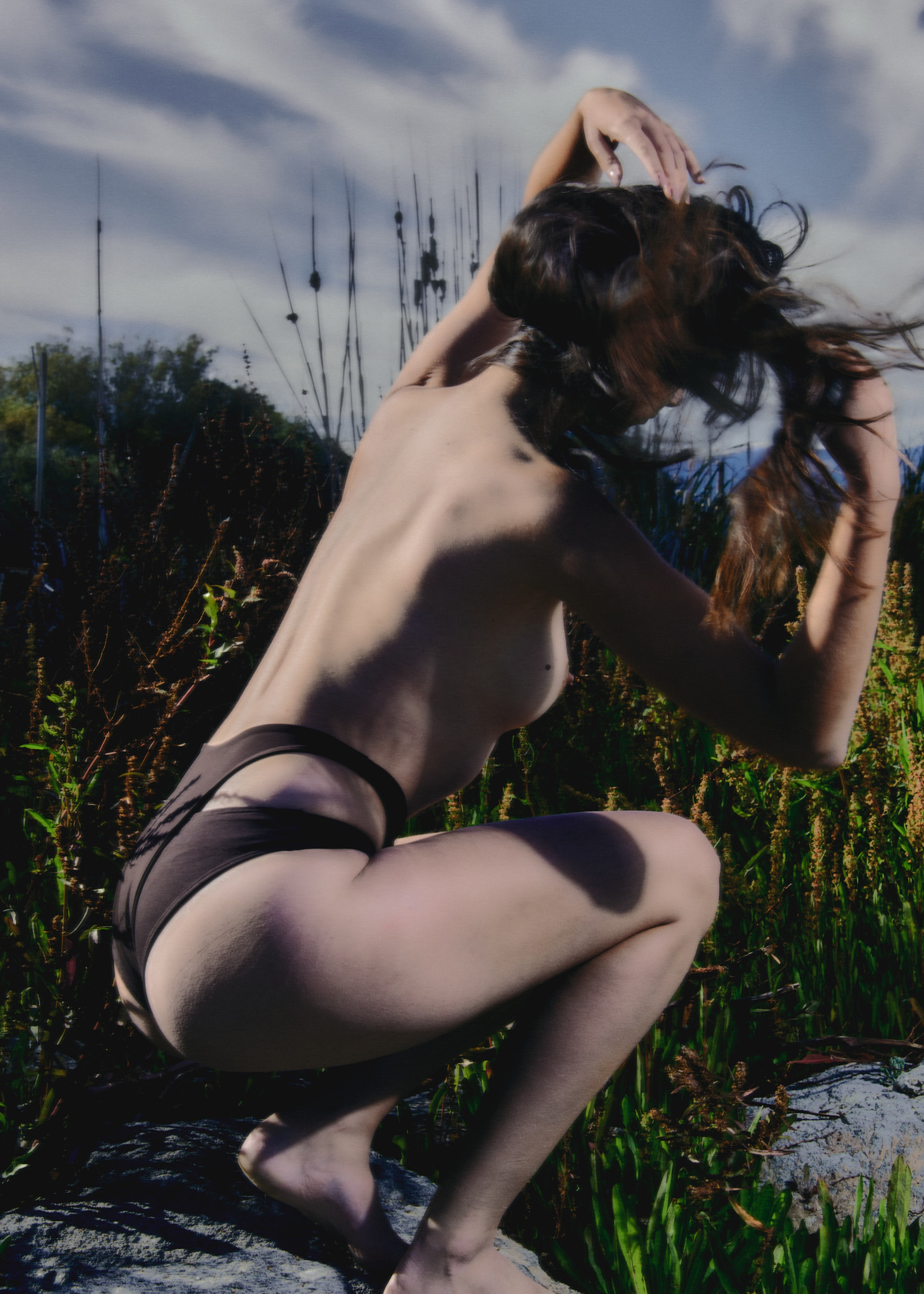
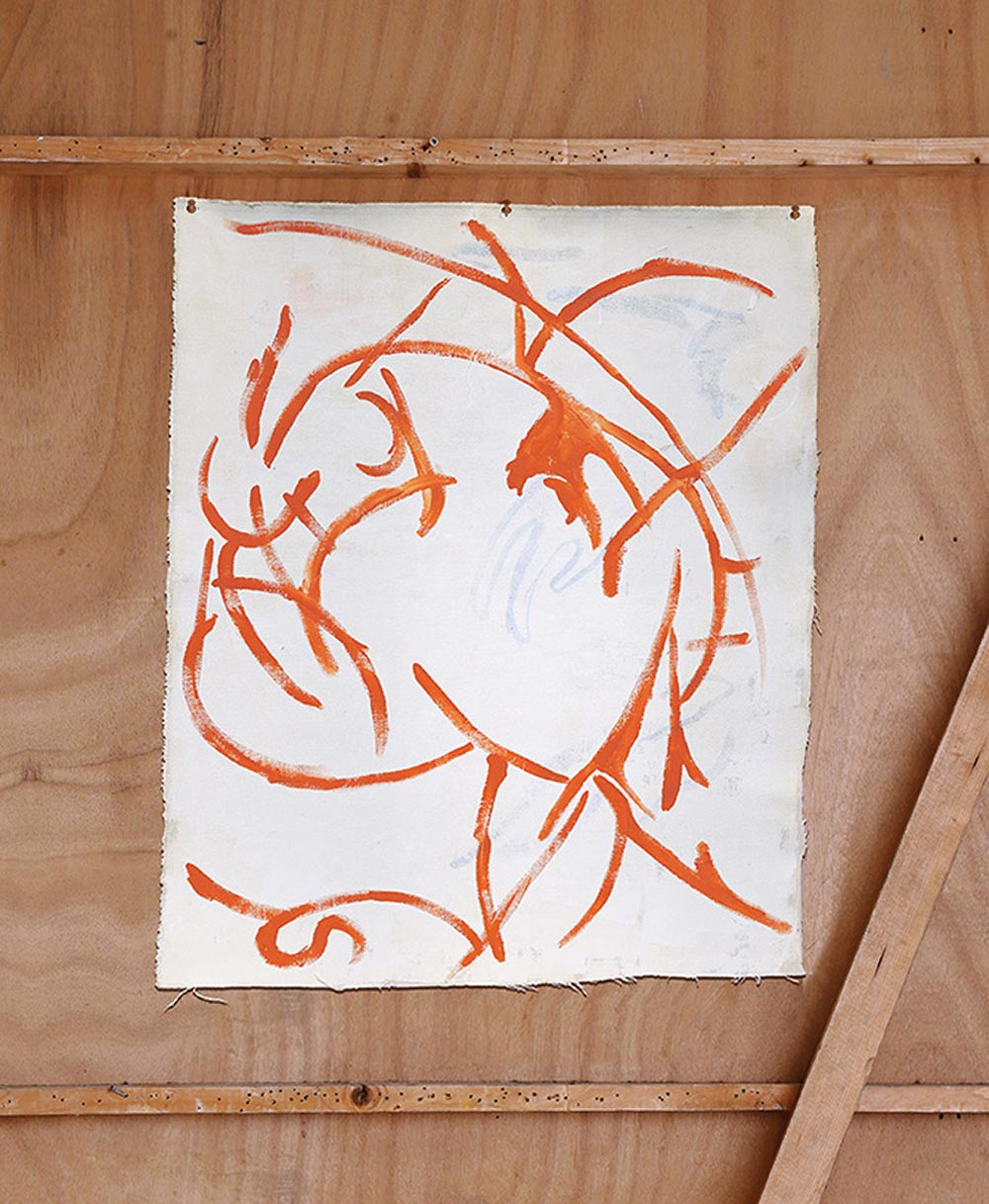
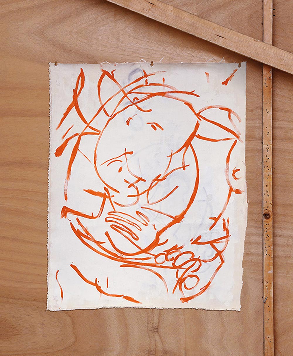
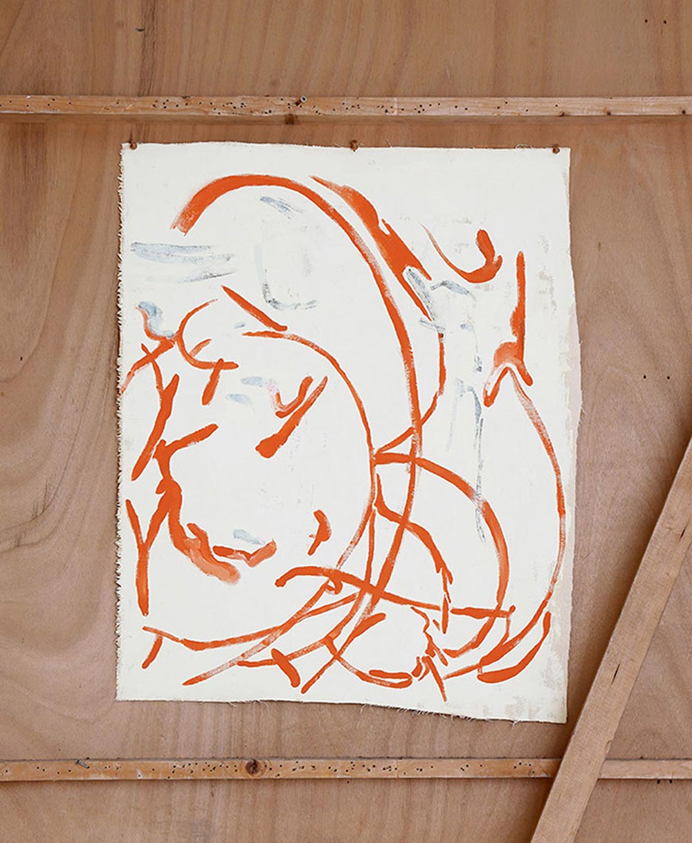
Y.-19, Campaign.-001, Diana
IN COLLABORATION WITH
JAN MELKA VISUAL ARTIST (fr)
EXTENSIVE CONVERSATIONS CO-CREATIVE PRODUCTION
STUDIO MITSU CREATIVE DIRECTION & CONCEPTION
Notes by the artist:
Diana: nature, strong woman
Mythological reference meaning the brand is eternal, historical so lasting throughout time, sustainable
Creation of patinated visuals using traces and successive layers, to empha- size the oldness of the brand and evoke a passage in time. The use of these canvases marked by time is a reference to the oldness and the longevity of the pieces of the brand.
Material used: canvas that becomes solid, like dried skin
Diana
Campaigns.-
For each new campaign, multi-disciplinary artists will be invited to portray a theme reflecting the values of the brand.
Theme
Goddess of the moon, child of nature, she lived and guarded the forest and the animals who resided within. She has been admired throughout ages for her strength, independence and singularity.
Essential figure of the brand, Diana is Labatut’s logotype for the values she symbolises and inspires.
Y.-20, Campaign.-002, Diana
IN COLLABORATION WITH
ALEX CASCALLANA PHOTOGRAPHER (es)
STUDIO MITSU CREATIVE CONCEPTION
Notes by the artist:
I like to think, at least in part, September is the first month of a new cycle. Maybe because we can enjoy the last summer days without the extremely hot weather of months before and at the same play with the firsts autumn winds.
It has been really great could portray and reflect the freedom and quietness of this period and put these feelings through the body of Adriana dyed of blue tones.

Y.-19, Campaign.-001, Diana
IN COLLABORATION WITH
STEPH WILSON PHOTOGRAPHER (uk)
EXTENSIVE CONVERSATIONS CO-CREATIVE PRODUCTION
STUDIO MITSU CREATIVE DIRECTION & CONCEPTION
Notes by the artist:
Given the theme of Diana, strongly referenced in Labatut’s branding, and the freedom to do whatever I wanted with it was a real treat (especially considering the ingredients of location, light and time I had access to.) I wanted to reflect a rawer angle of Diana, the Goddess of hunting, na- ture, and often associated with fertility.
I hoped that the story of whoever we shot would bleed into the character of Diana, as, I believe, she is in each of us. Mabel aches a confidence and sexuality in her movements: she is a cat, her performances are the hunt. Her dancing is a feral and brutal expression of female sensuality and confidence that I immediately wanted to incorporate into the images. After all, how much closer to being a Goddess than Mabel can you get?
Y.-19, Campaign.-001, Diana
IN COLLABORATION WITH
JAN MELKA VISUAL ARTIST (fr)
EXTENSIVE CONVERSATIONS CO-CREATIVE PRODUCTION
STUDIO MITSU CREATIVE DIRECTION & CONCEPTION
Notes by the artist:
Diana: nature, strong woman
Mythological reference meaning the brand is eternal, historical so lasting throughout time, sustainable
Creation of patinated visuals using traces and successive layers, to empha- size the oldness of the brand and evoke a passage in time. The use of these canvases marked by time is a reference to the oldness and the longevity of the pieces of the brand.
Material used: canvas that becomes solid, like dried skin